
Apple Intelligence is back, baby! That’s right: Two years after its initial launch, Apple is giving its generative AI features their first significant upgrade, along with a new version of Siri that the company has been strongly insinuating would be a part of each of the last two macOS releases, without ever actually announcing a release date.
Generative AI is unavoidable if you install macOS 27 Golden Gate. I’m being very literal: There used to be a toggle you could hit if you wanted to turn off Apple Intelligence and delete the gigabytes’ worth of AI models it would download to your disk, and now there isn’t. Apple Intelligence defines the Golden Gate release, in everything from its marketing to its features to the chips it runs on to the amount of space it takes on your disk. Ready or not, here it is.
But if you can manage to look past that fanfare somehow, the operating system underneath Apple Intelligence is getting the kind of update that macOS users usually proclaim to like. Golden Gate addresses the most irritating of macOS 26 Tahoe’s design sins, adds a big pile of incremental improvements, and promises a bunch of under-the-hood fit-and-finish optimizations to make common tasks feel just a little faster and more reliable than before.
This makes for a combination that is occasionally jarring: big, hard-to-ignore and impossible-to-disable AI changes wedded to an understated update that in other years might have been called a “ Snow Leopard release.”
System requirements: Farewell to Intel
The Golden Gate update is the first macOS release since the mid-2000s not to run on any Intel Macs. Six years after the beginning of the Apple Silicon era, Apple has dropped support for the last handful of 2019 and 2020-era Intel Macs that could officially run macOS 26 Tahoe.
That means that the Golden Gate update requires an Apple M1 chip or better/newer, a list of hardware that includes the following:
- 2020 M1 MacBook Air or newer
- 2020 M1 MacBook Pro or newer
- 2020 M1 Mac mini or newer
- 2021 M1 iMac or newer
- 2023 Mac Pro
- Any Mac Studio
- 2026 MacBook Neo
My primary testing hardware for this review has included an M1 MacBook Air (16GB/1TB), a 15-inch M3 MacBook Air (24GB/512GB), and a MacBook Neo (8GB/512GB), which means I have a pretty good sense of how Golden Gate and future macOS releases will treat Apple’s least-capable hardware.
The good news is that if you own any Apple Silicon Mac that isn’t falling apart, Golden Gate should run mostly happily. It also means all Macs support Apple Intelligence, which never ran on Intel-based hardware.
Apple Intelligence requirements
Golden Gate introduces a minor split between older Apple Silicon Macs and newer ones. Apple Intelligence in Golden Gate is powered by its AFM 3 Core model, which has been built “in collaboration with Google.” But there’s also an AFM 3 Core Advanced model, Apple’s “most powerful on-device model,” which has additional hardware requirements.
To run AFM 3 Core Advanced, you need both of the following:
- An M3-family processor or newer
- At least 12GB of RAM
(The RAM requirement is a bit odd—no Apple Silicon Mac has shipped with 12GB of RAM, though there are several iPhones and iPads that have shipped with that amount. Optimists can choose to believe that this means a MacBook Neo with an A19 Pro and 12GB of RAM will be released at some point during Golden Gate’s lifespan).
If you have an M1 or M2 Mac with 16GB or more of RAM, you’re still unsupported. If you own an M3 Mac with 8GB of RAM, you’re still unsupported. All M4, M5, and M6-based Macs clear the bar.
So far, the only features that require the more-capable model are more expressive voice capabilities for the new Siri and an improved voice-dictation feature. But I would expect to see the gap between older/less-capable Apple Silicon Macs and new ones grow, if and when Apple makes more changes to Apple Intelligence.
What to do with an unsupported Mac
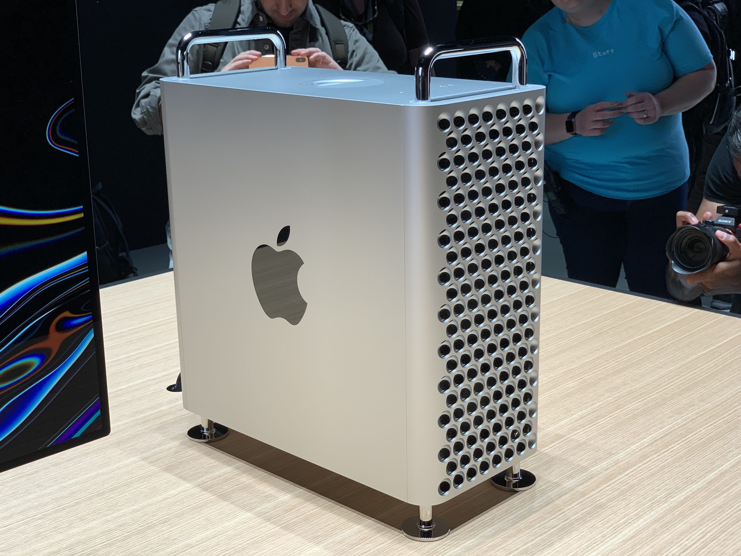
The 2019 Mac Pro is one of the latter-day Intel Macs being dropped by Golden Gate.
Credit: Samuel Axon
The 2019 Mac Pro is one of the latter-day Intel Macs being dropped by Golden Gate.
Credit:
Samuel Axon
Supposing you own an Intel Mac you’d like to keep using, your options are dwindling.
If the Mac you’re using still officially supports macOS 15 Sequoia or macOS 26 Tahoe, the path of least resistance is to continue running those operating systems until their security and Safari updates stop in the fall of 2027 and 2028, respectively (assuming Apple sticks with its past practice).
You won’t get most new features, and Apple doesn’t always patch every single security flaw in older OSes that it patches in the latest release. But you’ll still be officially supported, your system will continue to function, and you can just install stuff through Software Update without worrying about it too much.
If your Mac is older than that, if it stops at 2023’s macOS 14 Sonoma or an older version, you have fewer options. You can keep running unsupported macOS versions—Google Chrome supports everything going back to macOS 13 Ventura, and Firefox will run on versions as old as macOS 10.15 Catalina, to give you a sense of how long you can keep a Mac running at a sort of minimum-viable level of functionality. At that point, though, you’re opening yourself up to a long list of security vulnerabilities.
At one point, running newer versions of macOS on older hardware was possible through projects like the OpenCore Legacy Patcher, but that project has foundered as Apple has removed more Intel-native code from newer macOS versions. The project’s last official update was nearly a year ago, and it has never supported macOS Tahoe at a software level or the Apple T2 chip at a hardware level. You can get macOS 15 Sequoia running on mid-2010s-vintage Mac hardware if you like, but expect a hit-or-miss experience depending on your exact hardware.
Running Windows 10 via Boot Camp is supported on most of these Macs, but its security updates are drying up. It’s possible to install Windows 11 while using the old Windows 10 drivers, but unsupported Windows 11 installs come with their own quirks. And I think it’s pretty safe to say that most people don’t buy Macs to run Windows on them.
Linux is an option for some Macs, and it should generally run well enough on 2017-and-older models. But Macs with an Apple T2 chip use that coprocessor for a bunch of critical I/O functions, and support in Linux for those functions is hit or miss. Some special distros exist that aim to offer improved support for those Mac models, and the bleeding-edge-curious CachyOS provides support out of the box ( with several prominent pre-install asterisks). But the energy that exists in the Linux-on-Mac community is understandably mostly focused on more forward-looking Apple Silicon support.
My recommendation, due to how awful pricing has gotten thanks to the ongoing RAM and storage crisis, is that anyone with a Mac too old to run macOS 15 Sequoia should very strongly consider a hardware upgrade. That’s not just because of software support; Apple Silicon Macs are generally a huge step up in performance, battery life, and power efficiency. For older MacBook Air and MacBook owners, even the relatively underpowered MacBook Neo will feel like a decent step up in both speed and hardware build quality.
If your hardware is genuinely still functional, it’s frustrating to have to replace it. But at this point, that Mac is at least seven or eight years old, and new hardware will be the easiest way to keep going for the next seven or eight years.
Branding
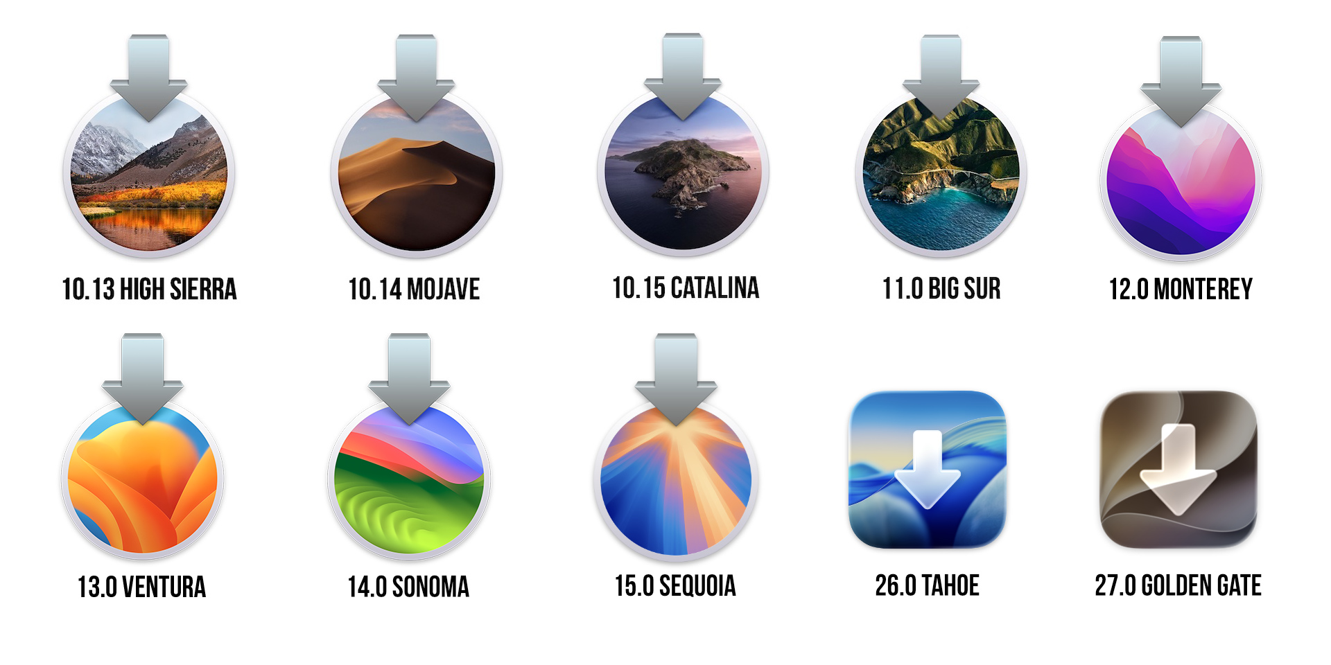
The evolution of macOS installer icons over the last 12 releases.
Credit: Andrew Cunningham
The evolution of macOS installer icons over the last 12 releases.
Credit:
Andrew Cunningham
As someone who has been to California pretty much exclusively for work and for weddings, I’ve always tried to approach Apple’s California-themed macOS codenames as an opportunity to learn a little something about the areas and landmarks that Apple has used for inspiration. I have rarely, if ever, found any kind of verifiable thematic link between the features or stated goals of a release and the name it’s been given. But it’s been fun to try.
Golden Gate is our second consecutive release named for a body of water, following a stretch of releases named for towns/regions (Big Sur, Monterey, Ventura, Sonoma, Sequoia) and another stretch named after things that are mostly rocks (Yosemite, El Capitan, Sierra, High Sierra, Mojave, Catalina). Maybe naming the Liquid Glass releases of macOS for bodies of water was intentional and maybe it wasn’t—only Craig Federighi can say for sure.
You might think that macOS 27 is named for the Golden Gate Bridge since it’s an iconic landmark and it factors into all the real-world desktop wallpaper videos in the operating system (there’s also, per usual, an “abstract color swirl” option, which in this release is gold that fades to black). Since opening to the public in 1937, this bridge has become synonymous with San Francisco and the Bay Area, the same way that the Empire State Building symbolizes New York City, or that sports hooligans symbolize Philadelphia.
But that’s not right! Did you know that the Golden Gate Bridge is so named because it’s a bridge that spans a strait called the Golden Gate? And not because it’s a bridge that is sort of arguably golden-looking and loosely resembles a gate? It had never once occurred to me to check my assumptions about this until now.
The name dates back at least as far as the 1840s, according to the memoirs of explorer and politician John Charles Frémont, which say that he recorded the name on a map of the area that he submitted to the US Senate in 1848. The name was appropriate, given the gold rush that began swelling the area’s population in that same year.

Towers go up in the Golden Gate strait as the now-iconic bridge is built.
Credit: Golden Gate Bridge Highway and Transportation District
Towers go up in the Golden Gate strait as the now-iconic bridge is built.
Credit:
Golden Gate Bridge Highway and Transportation District
The website for the Golden Gate Bridge Highway and Transportation District has a bunch of neat historical pictures and factoids about the construction of the bridge itself. The bridge was originally coated with lead paint to reduce corrosion from the Bay Area’s saltwater and fog (current coatings use zinc instead), and 11 people died during the bridge’s four-year construction process (“Although tragic, the number of lives lost was very low compared to the size of the project and the dangers involved.”)
The installer icon for the Tahoe update broke with 25 years of macOS tradition by moving away from the “circle with an arrow pointing downward toward it” format that macOS installers had used since the dawn of Mac OS X. Apple was trying to standardize on the squircle-style icon, and the installer followed suit. Golden Gate’s installer is another squircle, though if anything, it has an even larger, glassier arrow inside of it, as if to say, “You can complain all you want, but Liquid Glass is here to stay.”
Though Golden Gate takes up quite a bit more space on your disk than Tahoe—more on that momentarily—the installer itself isn’t all that much bigger than last year’s, at roughly 17GB. For those still creating USB install drives for new macOS updates, you’ll definitely need at least a 32GB disk to install Golden Gate.
Installation and free space: Golden Gate, devourer of GBs
It’s not a given that every macOS update will take up more space than the one before it—as recently as macOS 12 Monterey and macOS 13 Ventura, overall install size actually decreased in newer versions, possibly because of the steady removal of old Intel support code. But disk space requirements have been climbing steadily over the last several releases.
I had hoped that the removal of Intel code would mean that Golden Gate would save some gigabytes—the disk space savings that came from the removal of PowerPC code was one of the better features of macOS 10.6 Snow Leopard. But any way you slice it, Golden Gate requires significantly more disk space than Tahoe.
| M1 MacBook Air, 16GB RAM, 1TB SSD | System | Preboot | Data | Recovery | All volumes |
|---|---|---|---|---|---|
| macOS Tahoe 26.6.2, no AI | 12.64GB | 7.33GB | 4.69GB | 1.51GB | 26.17GB |
| macOS Tahoe 26.6.2, AI enabled | 12.64GB | 7.33GB | 17.16GB | 1.51GB | 38.64GB |
| macOS Golden Gate 27.0 b7, no AI (no Internet connection) | 12.65GB | 10.73GB | 5.91GB | 1.69GB | 30.98GB |
| macOS Golden Gate 27.0 b7, AI enabled | 12.65GB | 10.73GB | 17.85GB | 1.69GB | 42.92GB |
The main culprit is Apple Intelligence, which went from being an optional multi-gigabyte download in macOS 15 Sequoia and macOS 26 Tahoe to a mandatory multi-gigabyte system component in Golden Gate. It was bad enough that macOS updates would occasionally flip Apple Intelligence back on even after users had turned it off; now the option is gone entirely.
In an apples-to-apples comparison between Tahoe 26.6.2 with Apple Intelligence turned on and Golden Gate 27.0 beta 7 with Apple Intelligence turned on, Golden Gate needed a little over 4GB of extra space on an M1 MacBook Air, which is already a larger-than-usual increase. If you were running Tahoe with Apple Intelligence turned off, Golden Gate needed a whopping 17GB more space on the M1 MacBook Air, thanks to a mandatory multi-gigabyte language model download that kicks in automatically the first time you connect a freshly restored Golden Gate Mac to the Internet.
And if you have a Mac that can run the AFM 3 Core Advanced model—remember, that’s any M3-or-newer Mac with 12GB or more of RAM—you’ll need even more disk space. The Storage tab of the System Settings app says that the M1 MacBook Air and MacBook Neo needed around 14GB of space for Apple Intelligence after a fresh install. On the M3 MacBook Air, that number was 22.42GB.
One could be forgiven for being upset about a software update that consumes so much disk space in the middle of a historic RAM and storage shortage. What’s particularly frustrating is that Apple Intelligence is still fundamentally a fully optional component that is layered over the top of the core macOS experience.
Downloaded installers and recovery files don’t include it; if you set up a new Mac and don’t connect it to the Internet, everything else about the Mac still looks and works much like it did in Tahoe (complete with the older Spotlight and Siri designs). Set up Golden Gate in a virtual machine on top of macOS, and it never offers Apple Intelligence or downloads those models. It works perfectly fine (accounting for the additional overhead that comes from virtualization, anyway).
This is presumably how Macs in the EU will behave, since Apple still hasn’t committed to shipping the Apple Intelligence updates there yet.
For those who have been following Windows 11’s development since it launched in late 2021, this may feel familiar. Microsoft has been aggressively pushing its AI features on users, and the company has a long history of failing to respect its users’ choices. It’s possible to turn off or uninstall many of the AI-powered features in modern Windows, including the nth iteration of the Copilot desktop app, the Windows Recall data scraper, and the inscrutably named “ Click to Do.” But it’s not possible to turn off all of them, even if you chase down each of those individual toggles.
I understand that Apple wants people to use its new technologies and that it thinks it finally has a version of Apple Intelligence that is worth including by default on all of its devices. And there’s some benefit to Apple and app developers in being able to assume that any Mac running Golden Gate has Apple Intelligence and its baseline AFM 3 Core model installed. Apple probably doesn’t want to have to maintain the old Spotlight and the new Siri-fied Spotlight in perpetuity. I could go on.
But I still feel like users who want to opt out should still be allowed to—both because that toggle has already existed for two years and because there’s nothing keeping Golden Gate from functioning perfectly normally without Apple Intelligence installed. Some users don’t want AI at all; others might want to skip Apple’s entirely in favor of more capable third-party options. The way Golden Gate handles it, unless you’re in a country where Apple isn’t shipping this stuff, you have to set aside space for Apple Intelligence whether you want it or not.
Liquid Glass, take two
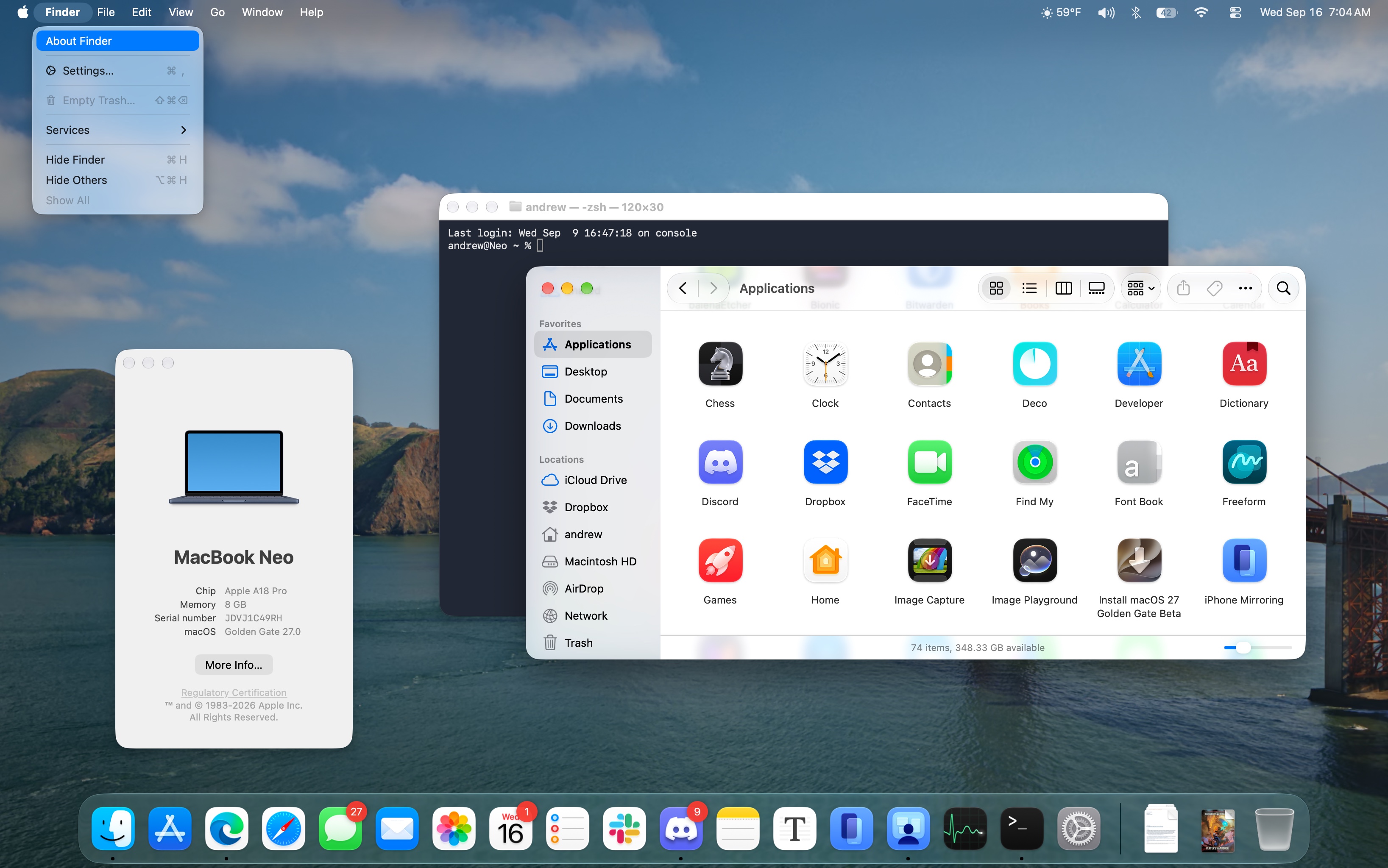
Golden Gate’s version of Liquid Glass is subtly refined. Users have more control over the glassiness, some icons have been spruced up while others have been removed, and windows once again have consistent corners.
Credit: Andrew Cunningham
Golden Gate’s version of Liquid Glass is subtly refined. Users have more control over the glassiness, some icons have been spruced up while others have been removed, and windows once again have consistent corners.
Credit:
Andrew Cunningham
Reports that users were holding off on operating system upgrades because of the Liquid Glass makeover turned out to be based on flawed assumptions. But grumbling about the new look and feel, particularly its macOS implementation, has been steady and sustained among the Apple fan/developer community’s design nerds (my biggest gripes are catalogued in last year’s review).
The Golden Gate update to Liquid Glass solves a fair number of the most common criticisms through both design changes and customizable settings. It doesn’t fix everything, and the changes are primarily iterative—if your quarrel is with the overall design direction, this update won’t help you.
Choose your glass
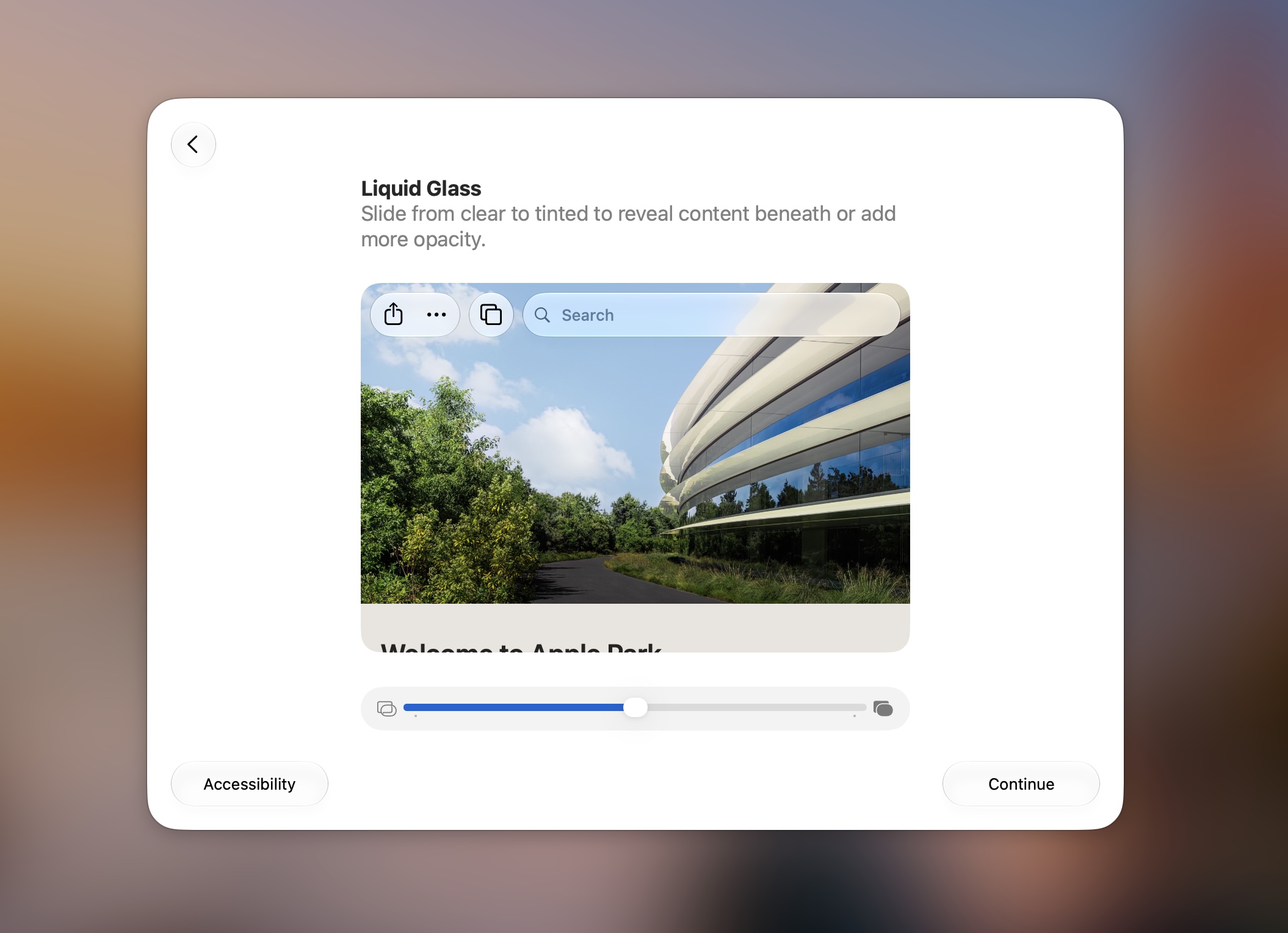
The new Liquid Glass slider is part of the setup flow. It’s in System Settings too.
Credit: Andrew Cunningham
The new Liquid Glass slider is part of the setup flow. It’s in System Settings too.
Credit:
Andrew Cunningham
The biggest change, and one that now appears as part of the device setup flow on new or newly upgraded devices, is a slider for the intensity of the glass effect. This builds on the binary “Clear/Tinted” toggle that Apple introduced in the 26.1 update. Sliding all the way to the left embraces the glassy bits and their light-bending properties; sliding all the way to the right tones down the sheen and translucency to levels more consistent with the old Big Sur-era design. The default setting is right in the middle (I’ll be evaluating it mostly based on how that middle setting looks).
If you were already using Liquid Glass in “Tinted” mode, the new slider doesn’t really change anything for you. But if you like the glass effect, you can now decide the exact amount you want to live with.
Glassiest.
Andrew Cunningham
Glassiest. Andrew Cunningham
Medium glassy, the default.
Andrew Cunningham
Medium glassy, the default. Andrew Cunningham
Maximum tint, which is the closest you’ll get to the old Big Sur-era styling.
Andrew Cunningham
Maximum tint, which is the closest you’ll get to the old Big Sur-era styling. Andrew Cunningham
Medium glassy, the default. Andrew Cunningham
Maximum tint, which is the closest you’ll get to the old Big Sur-era styling. Andrew Cunningham
When the UI is glassy, Golden Gate includes some subtle tweaks to the way that light is refracted and how clearly shapes and colors shine through layers of glass. I’m tempted to say it helps a little with readability, but mostly I think it looks “different” instead of “better.”
One change I do think is an improvement is the apparent retirement of the “soft” divider for window title bar areas. In Tahoe, the border between the title bar and the app’s contents existed, but it was invisible in some apps (Finder and Photos are two examples). An alternate “hard-style” divider was used in some other apps, retaining a bit of glassiness in the title bar but drawing a visible line between the title bar and your content and reducing the visibility of text and images located “beneath” the title bar.
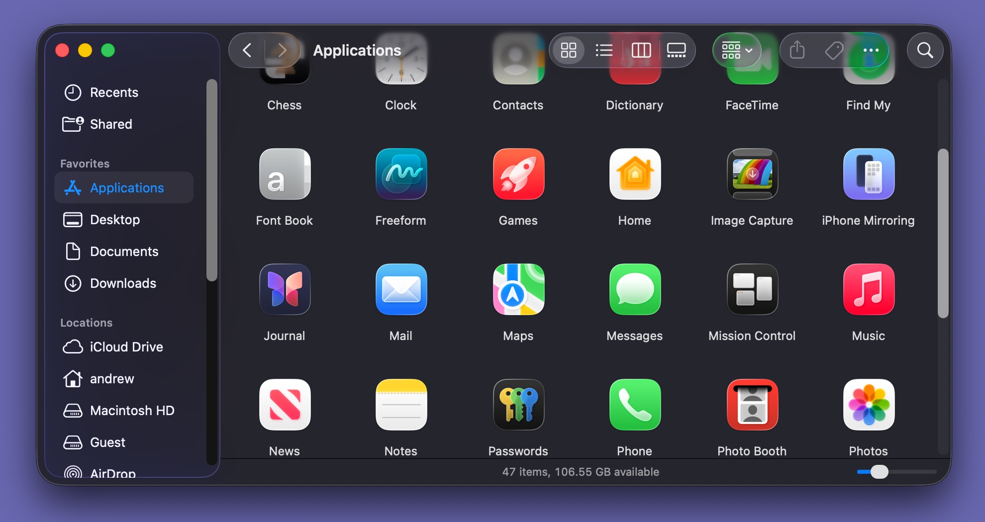
In this Tahoe window, you can see the sidebar nested in a sort of floating bubble that doesn’t extend to the edge of the window. The toolbar area also isn’t given any kind of hard border, and contents underneath are pretty visible.
Andrew Cunningham
In this Tahoe window, you can see the sidebar nested in a sort of floating bubble that doesn’t extend to the edge of the window. The toolbar area also isn’t given any kind of hard border, and contents underneath are pretty visible. Andrew Cunningham
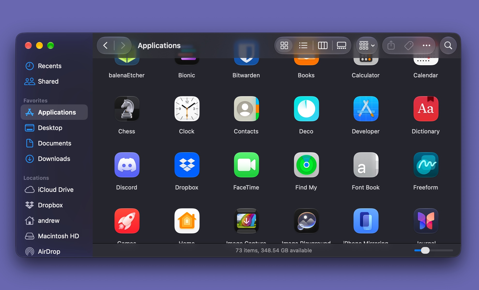
Golden Gate windows revert to something closer to the previous sidebar look, with colorful text labels and an edge-to-edge design. The title bar is still see-through, but it has a hard border again.
Andrew Cunningham
Golden Gate windows revert to something closer to the previous sidebar look, with colorful text labels and an edge-to-edge design. The title bar is still see-through, but it has a hard border again. Andrew Cunningham
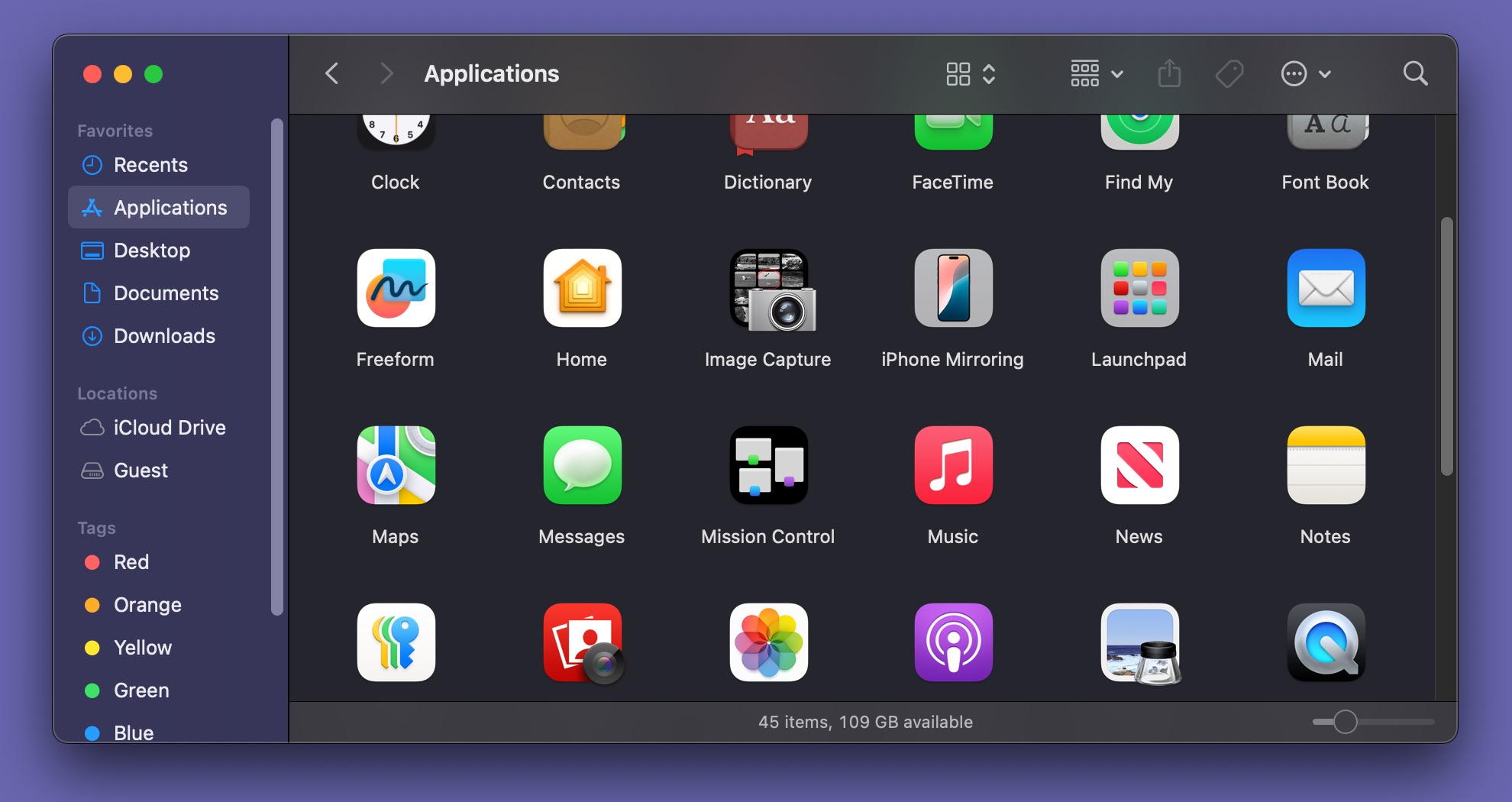
A window in macOS 15 Sequoia, for reference.
Andrew Cunningham
A window in macOS 15 Sequoia, for reference. Andrew Cunningham
Golden Gate windows revert to something closer to the previous sidebar look, with colorful text labels and an edge-to-edge design. The title bar is still see-through, but it has a hard border again. Andrew Cunningham
A window in macOS 15 Sequoia, for reference. Andrew Cunningham
In Golden Gate, windows generally default to the “hard” title bar. In apps like Photos and Finder, the title bar is always visible now. The Messages app uses an alternate style that fades into view when you hover over it or when you change focus to another window. Transparency and translucency remains. You still see shapes and colors underneath these title bars, with opacity that increases or decreases with your Liquid Glass slider position. But the “seamless” window look that some apps picked up in Tahoe has been mostly tossed for Golden Gate.
Tahoe could force the hard-style divider in all apps through “reduce transparency” in the Accessibility settings. But that’s a big catch-all toggle that switches off a bunch of other things that I don’t mind or actively enjoy. The adjustment in Golden Gate does a better job of letting title bars be title bars without totally tossing the rest of the glass effect.
One thing that gets a shade more glassy regardless of your chosen opacity: subtly glassy stoplight icons in the upper-left corner of each window. Like many other Liquid Glass elements, the new stoplights pick up a bit of bounciness, expanding subtly when you click them.
Corners and edges
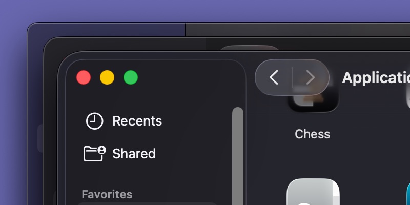
Comparing corners, from hardest to softest. On the bottom of the stack is macOS 15 Sequoia; on the top is the rounded Tahoe styling. The new corners in macOS Golden Gate split the difference.
Credit: Andrew Cunningham
Comparing corners, from hardest to softest. On the bottom of the stack is macOS 15 Sequoia; on the top is the rounded Tahoe styling. The new corners in macOS Golden Gate split the difference.
Credit:
Andrew Cunningham
Golden Gate walks back some of Tahoe’s changes to app windows, at least partially. Windows in Tahoe had extra-rounded corners. These corners were so much rounder than previous versions of macOS that, for much of the operating system’s life, most of the area you’d grab to resize a window rested outside the app window.
This issue was partially fixed in the 26.4 release, but it was one of several fit-and-finish problems that made Liquid Glass feel underbaked. Window radius sizing wasn’t even consistent between apps. Apps that retained a separate title bar, including Terminal, TextEdit, and System Information, used a second, less-rounded style. Other windows in the OS and third-party apps could confuse things still further, adding even more corner styles to the mix.
In Golden Gate, Apple both reverts to a smaller and less-rounded default window corner and makes that corner style consistent across all apps. The level of roundedness is somewhere in between the most-rounded version of Tahoe and the pre-Tahoe default, but the consistency is the main takeaway.
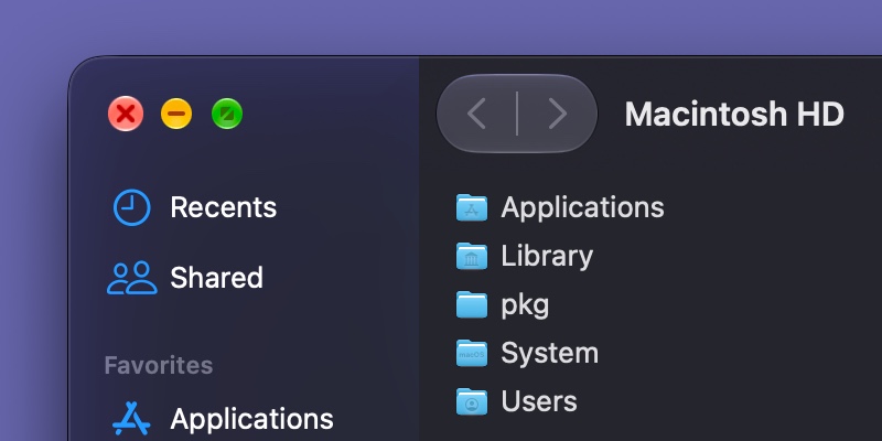
Glassy stoplight icons in Golden Gate. They subtly expand when you click them (the close button here is depicted mid-click.)
Credit: Andrew Cunningham
Glassy stoplight icons in Golden Gate. They subtly expand when you click them (the close button here is depicted mid-click.)
Credit:
Andrew Cunningham
Sidebars in apps like Finder, Photos, System Settings, and other apps also return to something closer to a pre-Tahoe default.
In Tahoe, the actual sidebar content area was a rounded glass rectangle that “floated” over the top of the contents of the window, another example of the seamless edge-to-edge effect Apple was trying to create with the original Liquid Glass iteration. In practice, though, this usually just ended up creating weird visual messiness in the sidebar area, as bits and pieces of pictures and text peeked out around the edges of this glass panel.
In Golden Gate, objects still pass “underneath” the sidebar, but those sidebars once again span all the way from the edge of the main content area to the edge of the window, as it did in older releases.
Sidebar icons regain the color they had in older releases, matching either the highlight color you’ve chosen in System Settings or a color of the app developer’s choosing in the default Multicolor mode. In Tahoe, these icons (and text labels) only showed color when actively selected. Actively selected sidebar items in Golden Gate get bolded text instead.
Less iconic
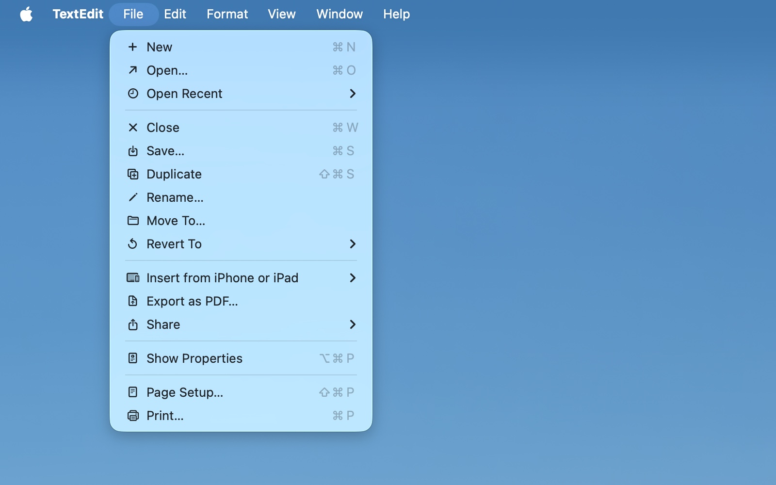
Tahoe’s menus used all kinds of little extraneous icons next to most items.
Andrew Cunningham
Tahoe’s menus used all kinds of little extraneous icons next to most items.
Andrew Cunningham
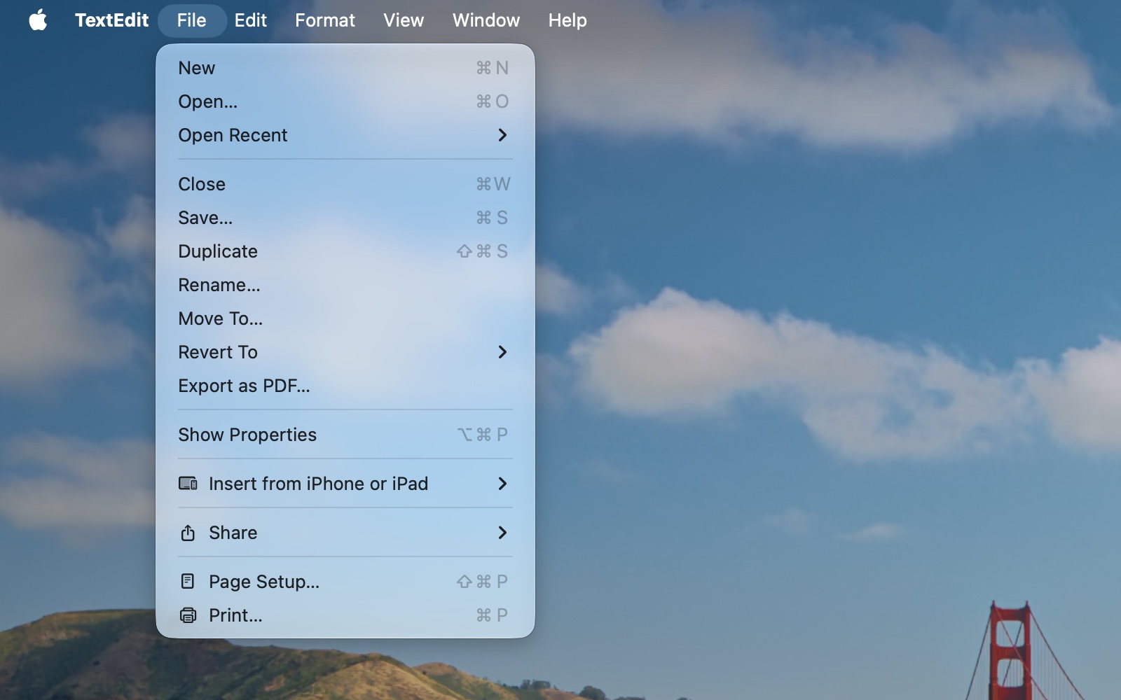
The Golden Gate design returns to using those glyphs sparingly and recommends that third-party developers do the same.
Andrew Cunningham
The Golden Gate design returns to using those glyphs sparingly and recommends that third-party developers do the same.
Andrew Cunningham
Tahoe’s menus used all kinds of little extraneous icons next to most items.
Andrew Cunningham
The Golden Gate design returns to using those glyphs sparingly and recommends that third-party developers do the same.
Andrew Cunningham
Both macOS 26 Tahoe and iPadOS 26 included a bunch of icons to accompany menu bar items, pulled from Apple’s SF Symbols library.
Golden Gate doesn’t completely excise these icons, but it does pull way back on them, ditching them for most common menu items. Apple’s Human Interface Guidelines for this year’s releases acknowledge which way the wind is blowing: They say that menu item icons should be used “sparingly and with purpose.” One is advised not to show an icon “if you can’t find one that clearly represents the menu item.”
As with the window corners, whether these icons added to or detracted from Tahoe’s design is debateable. What was indisputable was that there was zero consistency between icon conventions within Apple’s own programs, which used different icons for basic operations like “new” and “open” and “close” across different apps.
I’m not saying Apple designers across different app teams were told to find the best matches they could for every menu item and were let loose without much guidance, but… it’s one possible explanation that fits the available facts.
However Apple is feeling about menu item glyphs this year, the losers are third-party app developers that went to the effort to follow last year’s guidelines. If you just took the “free” icons in the Edit and Window menus and left everything else alone, those icons will vanish “for free” this year. If you did any work to add menu item icons for Tahoe, your apps will retain those icons in Golden Gate, and you’ll need to decide whether to keep them or walk them back.
Course corrections
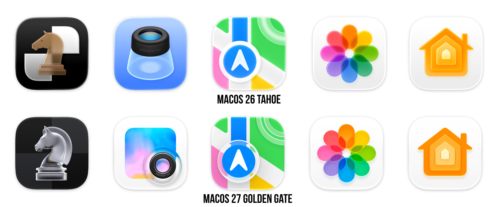
Liquid Glass-style icons in Golden Gate are sharper and, if anything, glassier than their Tahoe counterparts.
Credit: Andrew Cunningham
Liquid Glass-style icons in Golden Gate are sharper and, if anything, glassier than their Tahoe counterparts.
Credit:
Andrew Cunningham
Finally, Golden Gate makes another round of changes to Apple’s built-in app icons, following their glassification in Tahoe.
Most of the time, the designs themselves don’t change, and Apple has just made tweaks to the appearance of the glass effect. Occasionally, icons will get additional glass or other effects that weren’t there before. There are new glassy circles in both Maps and Stocks; circles in Image Capture and Migration Assistant have been resized; and a glowing dot at the end of the Activity Monitor line is new. Mostly it’s just colors and depth that look different.
If you’re the kind to engage in pixel-peeping, the overall effect is much sharper and more striking in Golden Gate than it was in Tahoe. You won’t always notice the difference from the distant remove of the Finder or Dock, but I found the extra detail made the icons more fun to look at.
Three icons also apparently merited an entirely fresh second take for Golden Gate. The chess icon’s checkerboard pattern becomes much subtler and extends all the way to the edges of the icon, and the knight looks like an actual glass chess piece rather than a brown wooden piece that’s semi-transparent for some reason. Preview is now a magnifier sitting on top of a second, colorful squircle rather than a magnifier in profile on a blue background. And the new Siri AI assistant obviously gets a new icon to match its new styling.
The net effect of all of Golden Gate’s design changes isn’t huge, and Golden Gate still looks more like Tahoe than like any previous version of macOS. Some controversial decisions remain in effect, like putting any non-squircle icons into “squircle jail” so they can think about what they’ve done.
But based on reactions I’ve seen during the betas, I expect these tweaks will be just enough to quell the loudest complaints, at least for people who were using Liquid Glass as an excuse not to upgrade.
Apple Intelligence gets real
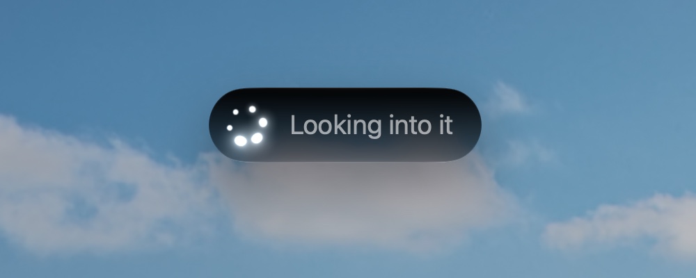
Siri working in macOS 27 Golden Gate.
Credit: Andrew Cunningham
Siri working in macOS 27 Golden Gate.
Credit:
Andrew Cunningham
I’m not a particularly big fan of generative AI. I do not use and have never used it at any stage of the research, outlining, or writing process for any article I’ve ever written, except for the times when I’m testing it so I can write about it. The obviously AI-generated flyers that come home from school with my kid or that get circulated around neighborhood groups strike me as benign but deeply tacky; the kinds of AI-generated images that get passed around by politicians online don’t even have the benefit of being benign.
More than anything, I’m just tired of seeing it everywhere, tired of being on the lookout for it, tired of it polluting every stream of information I have access to. Wasting time actively trying to avoid auto-generated slop is now a daily fixture of my life.
That being said, Apple Intelligence and Siri AI in the Golden Gate release do feel like they clear a minimum viable bar for usefulness and entertainment value that they weren’t clearing before.
Features like Image Playground used to be pretty embarrassing; the version in Golden Gate is at least competent enough to feel like something worth playing with. I am rarely tempted to screenshot ludicrously summarized stacks of notifications, something that used to happen pretty regularly (it helps that, at some point, summaries for big stacks of notifications now only seem to be trying to summarize the three-or-so most-recent notifications in the stack).
The models Apple uses, where they run, and what they handle
Let’s begin with an explanation of what’s powering the new Apple Intelligence before moving on to the features it’s powering.
Apple likes to brag about the amount of Apple Intelligence processing that happens directly on-device without heading out to the cloud, and the company has made advancements here. But all the headlining features, including Siri, Image Playgrounds, and the Xcode coding assistants, are leaning heavily on cloud compute to work.
AFM 3 Core is the on-device model that runs on every single device that supports Apple Intelligence, from the iPhone 15 Pro to an M5 Ultra Mac Studio. AFM 3 Core is used for general text summaries and understanding images.
Apple measures the performance of these models by showing human evaluators the outputs of the new and old models and asking them which they prefer—the numbers for AFM 3 Core are promising, but they show how tricky it can be to make AI models (particularly smaller ones with fewer parameters) do anything consistently.
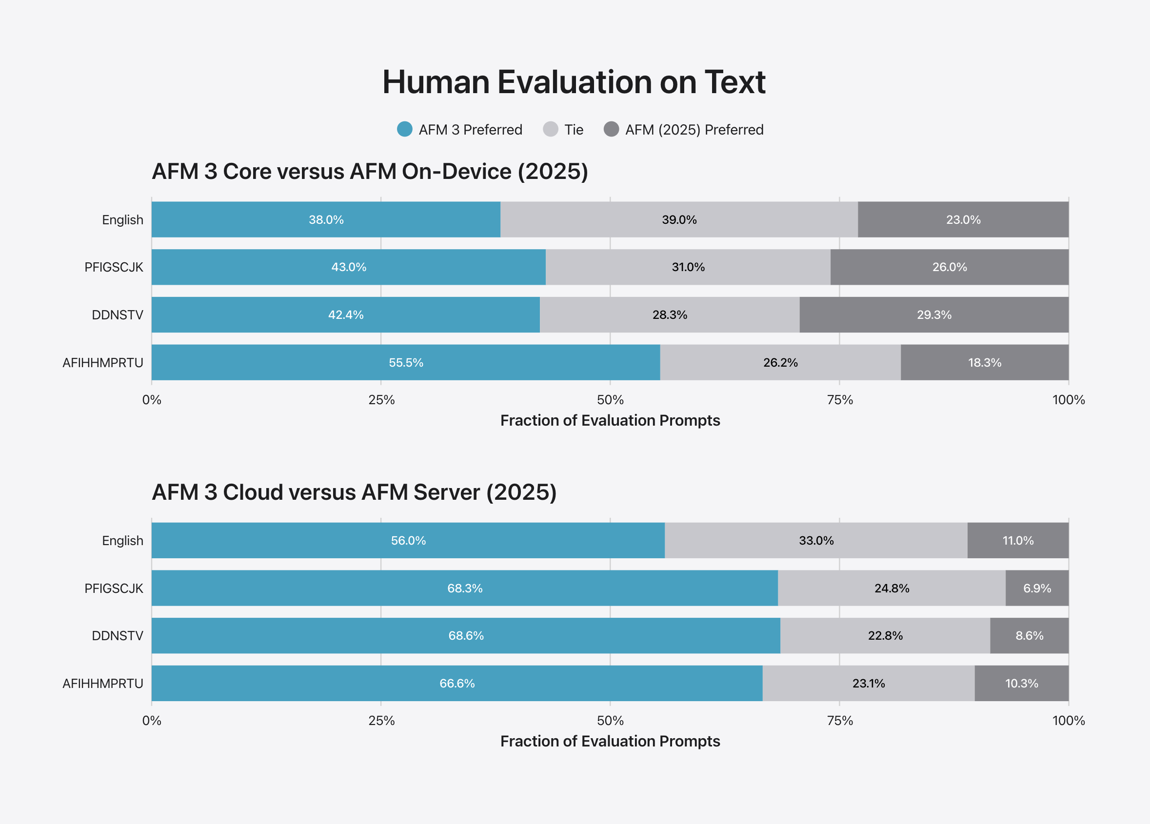
Apple’s data comparing this year’s AFM 3 models to last year’s is fuzzy but generally points to broad improvement for both on-device and cloud models.
Credit: Apple
Apple’s data comparing this year’s AFM 3 models to last year’s is fuzzy but generally points to broad improvement for both on-device and cloud models.
Credit:
Apple
When it comes to generating English-language text, evaluators preferred AFM 3 Core 38 percent of the time and last year’s AFM model 23 percent of the time, and they couldn’t tell a difference 39 percent of the time. For image understanding, evaluators preferred AFM 3 Core 26.6 percent of the time and last year’s AFM model 16.8 percent of the time; and they had no preference 56.6 percent of the time.
Those numbers tell a pretty fuzzy story—nearly a quarter of the time, people perceived the new model as a downgrade, which is kind of a lot! But the “the majority of the time, people thought the new model was better or couldn’t tell the difference” essentially lines up with my own vibes-based assessment of Apple Intelligence in the 27 OS releases.
AFM 3 Core Advanced is the model that requires an M3 or newer with 12GB or more of RAM to run, and it’s used primarily to improve both text-to-voice (via more expressive Siri voices) and voice-to-text (by improving voice dictation). Apple’s announcement goes into more depth about how it got this model running locally, which involves running some parts of the model in RAM while periodically augmenting it with “experts” that are stored in a device’s slower-but-more-plentiful SSD.
AFM 3 Cloud is where you stop being able to run models on device and instead start relying on Apple’s own servers (running Apple’s own silicon) to handle your requests. And it’s the model that macOS will turn to for just about anything you ask the new Siri, or any requests for rewriting or summarizing information.
The good news is that the AFM 3 Cloud’s improvements over the previous AFM Server model are much larger and less ambiguous than AFM 3 Core’s improvements over the old AFM Core.
Apple Diffusion Model (ADM) 3 Cloud is also a cloud model running on Apple’s servers, and it powers the image generation features in Image Playground, Notes, and other places where you can generate or alter images.
And then there’s AFM 3 Cloud Pro, which Apple says is for “agentic tool use and complex reasoning.” Apple had to turn to Nvidia GPUs running in Google’s cloud to make this model work, though the company says it is leveraging Nvidia, Intel, and Google technologies to enable privacy capabilities similar to the ones it offers for its own server hardware.
“Usage limits may apply”
Apple allows app developers to access all of these models. The on-device models are available to use without any limitations. Use of Apple’s cloud models can be rate-limited, something that Apple associates with your Apple ID so that developers don’t need to track usage themselves. That means if you run out of image credits for AFM 3 Cloud (Image) in Image Playground, you’ll be out of credits for any third-party app that calls that model through Apple’s APIs. An “Evaluations” framework exists to help developers test and decide which of the models to use to get the results they want.
During the betas, Apple hasn’t imposed any usage limits on any Apple Intelligence features in macOS. Based on a support document published on September 9, the initial rollout of macOS 27 Golden Gate, iOS 27, and the other updates won’t impose usage limits either. But limits are coming “in the future” and will apply to Siri AI, any photo editing tools that use Apple Intelligence (including Clean Up, Extend, and Spatial Reframing), Image Playground, usage of the AFM 3 Cloud models in the Shortcuts app, and any third-party apps that call on any of the cloud models.
Apple hasn’t said what limits users can expect, just that they will vary “by feature, request complexity, system demand, system policies, and other factors” and that additional usage “will be available for a fee.” Apple gates some Home app features, like video summaries from cameras, to upper-tier iCloud+ plans, and I wouldn’t be surprised to see other Apple Intelligence limits tied to iCloud upsells.
Siri AI and Spotlight
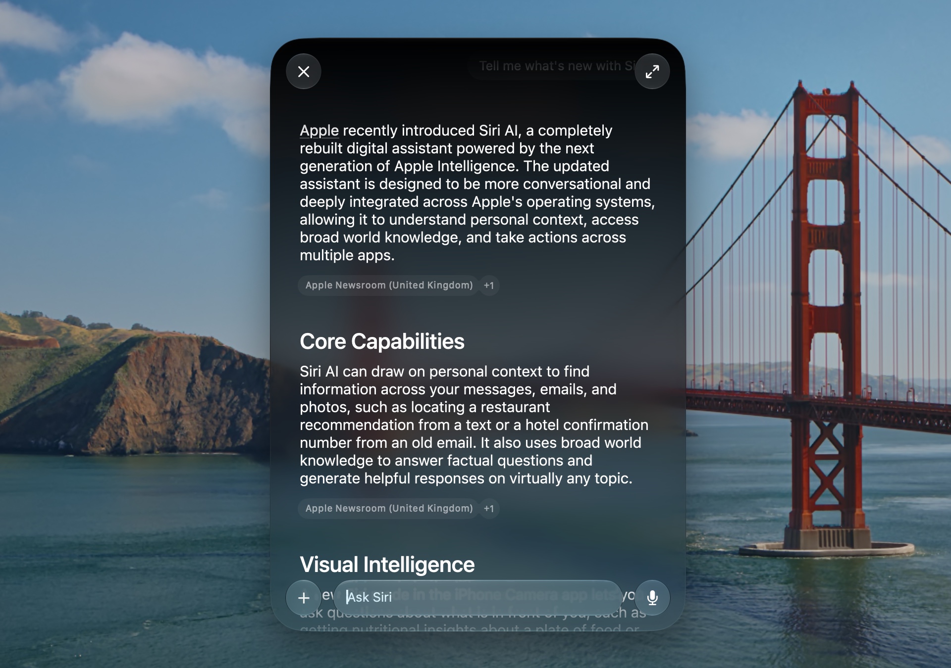
A Siri answer in the Spotlight window in macOS 27 Golden Gate.
Credit: Andrew Cunningham
A Siri answer in the Spotlight window in macOS 27 Golden Gate.
Credit:
Andrew Cunningham
When fiction like Star Trek sold us all on the concept of a voice-controllable computer, that vision never included moments where the computer would say, “I can’t handle that question, would you like me to search the Internet for it?”
But that’s the norm with Siri for anything other than specific direct requests phrased in exactly the way that Siri expects them. I’ve long since given up on using Siri for anything other than setting timers or quick reminders.
Siri AI (in beta in the US for English speakers, unavailable elsewhere for a combination of technological and regulatory reasons) is a serious effort to change that status quo. On systems where it’s enabled, it takes over for both the old Siri and for Spotlight, unifying the interface you’d use for local file searches, basic old-school Siri commands for things like setting timers, more complex requests that pull from the data on your Mac (“show me all my meetings for next week”), and general chatbot questions.
When Siri AI is enabled, the Spotlight interface changes to a narrower, darker, more rounded search box, though aside from this new presentation, its functionality as an app launcher, clipboard history tracker, and file search mechanism all seem pretty similar to the way it was before.
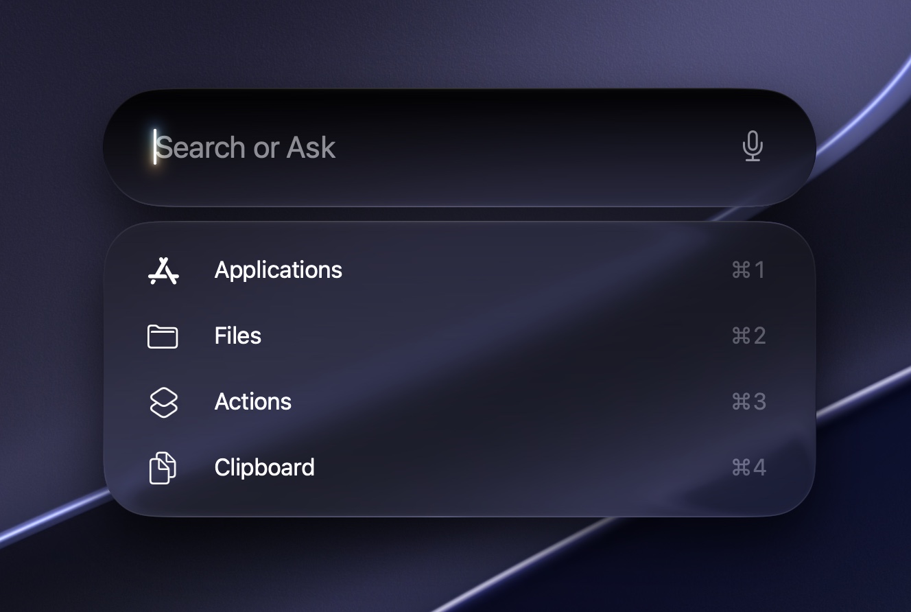
Spotlight in Golden Gate looks different and is directly integrated with Siri now, but the core functionality and keyboard shortcuts are the same as before.
Credit: Andrew Cunningham
Spotlight in Golden Gate looks different and is directly integrated with Siri now, but the core functionality and keyboard shortcuts are the same as before.
Credit:
Andrew Cunningham
But when you type in something that’s a Spotlight app/file search or a simple “set a timer/do some unit conversions”-type command, Siri reaches out to Apple’s cloud to get an answer for you. This experience is pretty similar to the way most chatbots handle it: a response to the question, a few bullet points of contextual information sometimes, a reminder that Siri is an AI tool and that its answers aren’t always accurate, and a handful of tiny source links at the bottom, collapsed behind a button, which may or may not lead out to original human-generated verifiable information if you follow them.
By default, Siri uses the Apple models described above, primarily the AFM 3 Cloud model (you can tell the local models can’t do much here because most Siri queries fail if you switch off your Internet connection). ChatGPT is still available in System Settings as an extension, with an option to make it speak using a different voice than Siri’s.
While Apple Intelligence as a whole can’t be turned off, users can opt out of the Siri AI beta at this point if they’d like. If you do this, you’ll be given the option to turn Siri off entirely or to use what Apple now dubs “Siri Classic.” In either mode, the UI for Spotlight reverts to its previous style.
The new Siri experience is so much like Copilot or the AI answers in Google Search that it barely seems worth remarking upon, which is both a comment about how “behind” its rivals Apple is in the AI race and how “caught up” Apple feels now that it’s shipped something usable.
One consistent barrier is that Siri can only occasionally help you with making your Mac do things; I’ve found that Siri can generally help change settings that are available in the Control Center, things like toggling Bluetooth or Light/Dark Mode, or turning screen brightness or volume up and down. Often it does that by presenting you with toggles you need to click yourself, but it can still help. It’s also capable of working with data inside individual apps—creating a note and dropping a few links in it, or pulling all of your week’s meetings from the Calendar app.
But when it comes to manipulating more advanced system settings, Siri will look up and give you directions rather than trying to do anything for you directly. You could imagine a Siri AI that would help you set up an SMB file share, enroll/unenroll in an Apple beta program for updates, change your default browser, or even download and install apps. But that’s all well outside of the current Siri’s capabilities, as is directly manipulating files via the Finder. Even reading file metadata isn’t something Siri will do for you—asking it to show me the EXIF data for an image on my disk got me directions rather than displaying any of that information directly.
Not that I think that’s a bad thing, necessarily. To give Siri carte blanche access to your filesystem and advanced system settings is to give a lot of users enough rope to hang themselves. That Siri can describe how to do many of these things is at least a step in the right direction that doesn’t put data at risk.
The Siri app
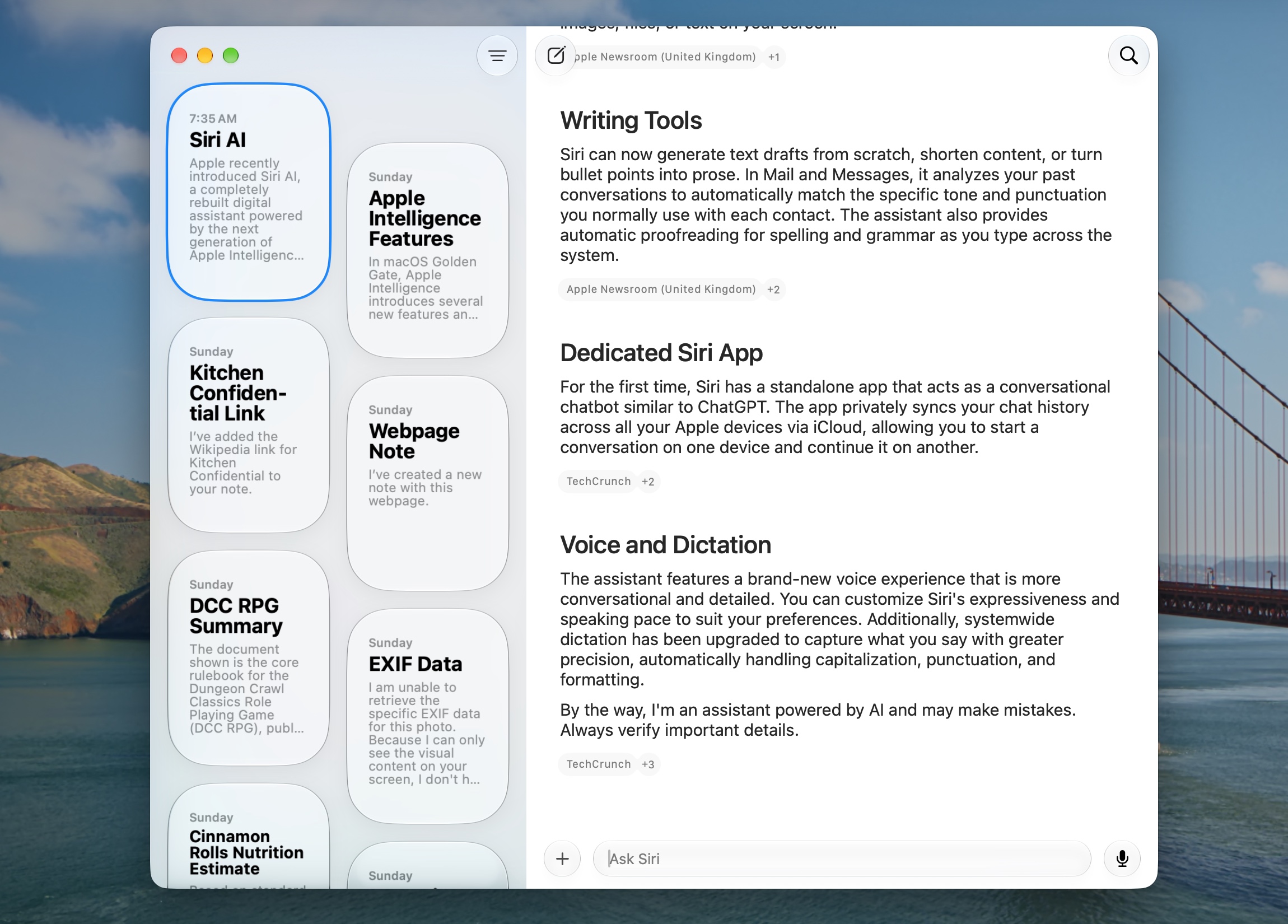
The Siri app isn’t much to look at, but there are worse things to be than “minimalist and functional.”
Credit: Andrew Cunningham
The Siri app isn’t much to look at, but there are worse things to be than “minimalist and functional.”
Credit:
Andrew Cunningham
The Siri app isn’t much to look at, but I actually like that about it—I’ve lost track of the number of completely different Copilot apps Microsoft has shipped with Windows 11 and what the capabilities of those versions have been. Compared to that, it’s kind of nice to have a simple, clean, Mac-native app that just presents a chronological list of every question or conversation you’ve had with Siri.
The Siri app is the place to find any previous Siri interaction you’ve had, allowing you to look up past answers it’s given you and continue older conversations with context intact. You can start new conversations here, too, if you’d like to go to Siri directly rather than starting a chat through Spotlight or the menu bar Siri icon.
Among the barebones app’s settings are options for viewing your chats in a list or grid format, pinning certain conversations, and making text bigger or smaller.
In the System Settings app, it’s possible to change the conversation retention settings from the default “Forever” to either one year or 30 days, change the number of visible lines in each preview, and decide whether the app opens to your past conversations or a brand-new one.
This conversation list will sync with your iOS/iPadOS/etcOS 27 devices via iCloud if you’re signed in, though at this point, you don’t have to be signed in to use Siri, Image Playgrounds, or any of the baseline Apple Intelligence features. (Again, I would expect this to change if and when Apple begins instituting usage limits on this stuff.)
Guided by voices
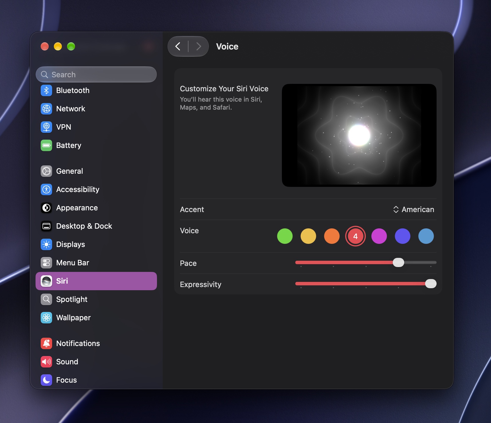
Macs with an M3 or newer and 12GB or more of RAM get more expressive Siri voices and better dictation, thanks to Apple’s on-device AFM 3 Core Advanced model.
Credit: Andrew Cunningham
Macs with an M3 or newer and 12GB or more of RAM get more expressive Siri voices and better dictation, thanks to Apple’s on-device AFM 3 Core Advanced model.
Credit:
Andrew Cunningham
Also in the Siri tab of the System Settings, users of Macs that meet the minimum requirements for the AFM 3 Core Advanced model (M3 or newer, 12GB of RAM or more) get extra options for deciding what Siri’s voice sounds like.
As before, users can select from multiple accents and voices. But these Macs have “pace” and “expressivity” sliders for adjusting exactly how they want the voice to sound. Pace controls how quickly the voice speaks, and expressivity controls how much up-and-down inflection the voice uses as it’s speaking. Sliding this all the way to the left gets you closest to the flat, mostly affectless voice of the older Siri.
Not all of the currently available accents have pace or expressivity options. Currently, Siri only offers them for American and British accents. Non-American accents have fewer voice options. I’d expect this situation to improve a bit as Siri AI moves toward dropping the “beta” label, though there are obviously no guarantees.
People on M1 or M2-series Macs, the MacBook Neo, or an M3 Mac with 8GB of RAM still have voice options, but they’re limited to the same handful of more robotic-sounding Siri voices as before.
“Ask Siri” and Visual Intelligence
Siri isn’t just confined to the Spotlight bar or the Siri app. Right-click menus throughout the operating system and in all of Apple’s apps invite users to “ask Siri” for just about anything, which is a window into the “visual intelligence” feature that appeared on iOS and iPadOS last year but is new to macOS this year.
“Ask Siri” is how you have the assistant try to write, rewrite, or summarize specific bits of text; identify the building in the background of a vacation photo; or send data to another app. Some writing apps, including Notes, will offer a “write with Siri” option, though it’s just another route to the same destination.
App developers have a framework for integrating their own apps with visual intelligence, to make sure that the contents of their apps can be used while asking or answering questions.
I find it annoying that this Ask Siri item appears at the top of nearly every single right-click menu almost anywhere in the operating system (apps that haven’t been updated for macOS 27 or to integrate with Apple Intelligence won’t show it). I’d also like there to be a toggle for hiding this icon that doesn’t require turning off Siri AI or reverting to the earlier version.
Apps: Image Playground
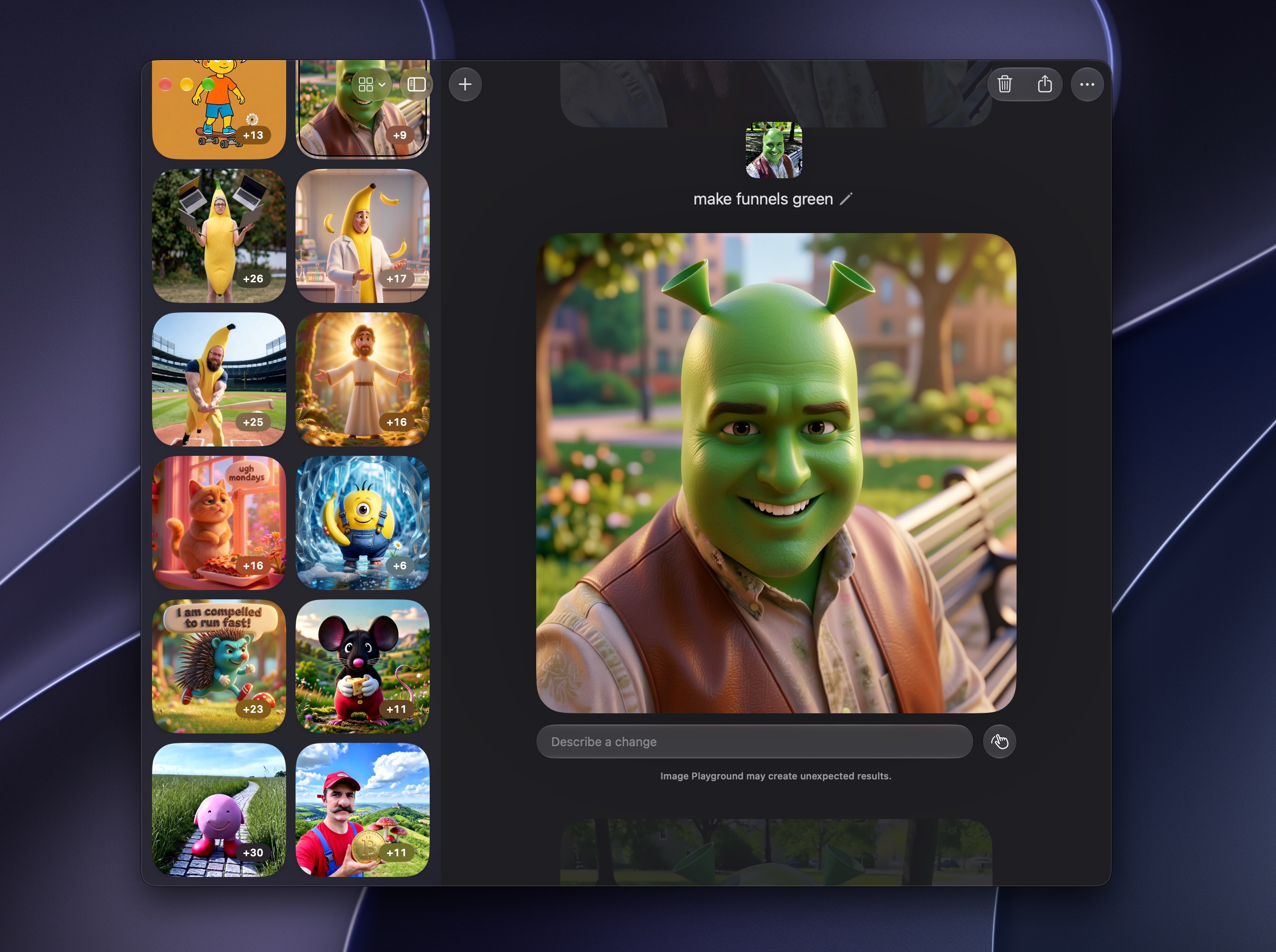
Oh, my beautiful copyright-free goblins.
Credit: Andrew Cunningham
Oh, my beautiful copyright-free goblins.
Credit:
Andrew Cunningham
To extend Apple’s own metaphor, the original Image Playground was one with broken swings, a merry-go-round that wouldn’t spin, and a slide with a big divot at the bottom for butt-wettening puddle of water. Image Playground in Golden Gate is, at least, a place where you can go to have a good time for a while. Sure, there are larger, better parks on the other side of town. But this one’s right near the house.
The previous Image Playground was based on the idea of describing an image you’d like to see and then describing changes to iterate on it until you had what you wanted. The problem was that iterations were completely unpredictable—things would change even if you didn’t ask for them to change, and trying to get an image that was usable even for “joke avatar in a roll20 session” was difficult.
The new ADM 3 Cloud model is not a cutting-edge image generator. It can still make pretty weird-looking things. It still “drifts” a little through the iteration process, changing things you didn’t ask it to change. And even the images that come out right still have that uncanny valley AI sheen to them. But the app is a lot more usable and predictable than it used to be, to the point that playing with it was actually fun. Sometimes that fun comes from the app rendering a person holding a banana in a completely unhinged way or generating a speech bubble that only partially encompasses the word you meant to fit in it. But fun is fun.
The app’s UI changes to mirror the new Siri app’s. A simple sidebar on the left displays every image you’ve generated with the app so far, separated into stacks. Each stack represents a single prompt or modified image, with the original images and all their iterations stored in one stack so you can page through, delete, and re-iterate on them individually.
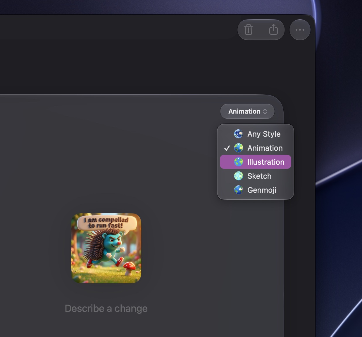
Image Playgrounds generates images and iterations in five styles.
Credit: Andrew Cunningham
Image Playgrounds generates images and iterations in five styles.
Credit:
Andrew Cunningham
The app can generate images in one of three aspect ratios (square, landscape, portrait), and it can pull people and images from your Photos library or elsewhere on your disk. When you generate an image or iterate on one, you get five styles to choose from:
- “Any style,” the only one that will generate realistic-looking images
- “Animation,” which makes everyone look vaguely like they belong in the movie Frozen
- “Illustration,” which makes those eerie, too-clean-looking 2D cartoon drawings
- “Sketch,” which is the same thing but done by hand with colored pencil
- “Genmoji,” which pops out images in the style of Apple’s emoji library
Image Playground works best when you get pretty close to the image you want in your first go and then add anything else you want within two or three iterations (giving it multiple instructions at once, separated by commas, is a good way to cut down on the number of iterations you make).
I recommend this because of the drift I mentioned—the thing you requested will almost always change, and it will usually change in the way you asked it to. But with every iteration, the model just makes things more in a way that amplifies the uncanniness of it all. Animated characters get smoother and more exaggerated. Backgrounds gradually get busier and busier and busier. Skin tones and other colors get more and more stylized and weird. And the background of every single picture is always, always, gradually creeping toward a hazy facsimile of a golden-hour sunset.
Apple obviously has some kind of guardrails in place to try and prevent people from either depicting copyrighted characters or making images that are in the style of copyrighted characters. Some of the most fun I had with Image Playground was in gradually scooting around those prompts, one iteration at a time.
Sometimes the app would see what I was doing and refuse to do anything else. I made a bald businessman look enough like Shrek from the movie Shrek that it would no longer let me add anything to the image, let alone change the background to look like a “swamp” or a “bog” or a “dirty lake.” But I could often iterate to an identifiable likeness of a copyrighted character in a way the app would refuse to do if I tried it all at once.
The process of trying to defeat the app’s safeguards were actually kind of instructive. Generating an “italian plumber with a red hat” made a guy who had a giant mustache, even though I didn’t mention facial hair at all. Creating a “round pink creature” automatically made one with little flipper-like arm appendages, even though I didn’t say anything about arms. The data these models were trained on casts a long shadow and announces itself in subtle ways.
Safari 27
The new features in Safari 27 are mostly about trying to help tame the web, sometimes with an assist from AI and sometimes not. Let’s go from least to most (potentially) useful.
Automatic tab grouping
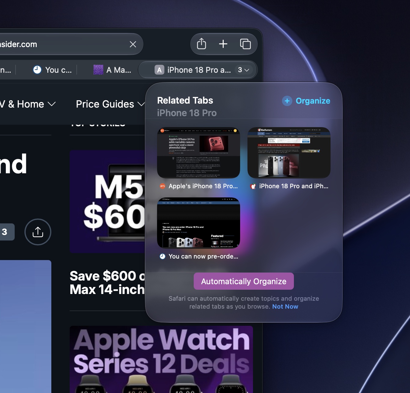
Safari 27 in Golden Gate will offer to automatically group tabs with related topics.
Andrew Cunningham
Safari 27 in Golden Gate will offer to automatically group tabs with related topics. Andrew Cunningham

A tab bar with both individual tabs and automatically generated groups of them.
Andrew Cunningham
A tab bar with both individual tabs and automatically generated groups of them.
Andrew Cunningham
Safari 27 in Golden Gate will offer to automatically group tabs with related topics.
Andrew Cunningham
A tab bar with both individual tabs and automatically generated groups of them.
Andrew Cunningham
Safari 27 in Golden Gate supports tab grouping, a way to organize tabs on top of the methods that already exist (separate profiles for home/work, opening different windows to use for different things).
The default behavior is for tab grouping to be manual, though Safari will recommend groupings based on topic. Another option outsources the grouping to Safari entirely, letting the browser use its recommendations to group the tabs automatically.
Safari begins suggesting groups (or automatically grouping tabs) once you have at least three open tabs that pertain to the same loose topic (“iPhone 18 Pro,” “local AI”) or that come from the same site (Google Drive). For tabs where Safari has a group to suggest, users can click a down arrow icon on the right side of the tab that shows t


